Danielle's Sauces — Brand Refresh & Packaging System
Founded in 1991, Danielle's Sauces is a family-owned gourmet sauce company based in Oregon. Built on the belief that sauces should complement rather than overpower food, the brand has spent more than three decades crafting award-winning products. Following the introduction of new flavors and multiple Scovie Award wins—one of the highest honors in the specialty sauce industry—the company sought a refreshed identity that reflected its growth while honoring its heritage.
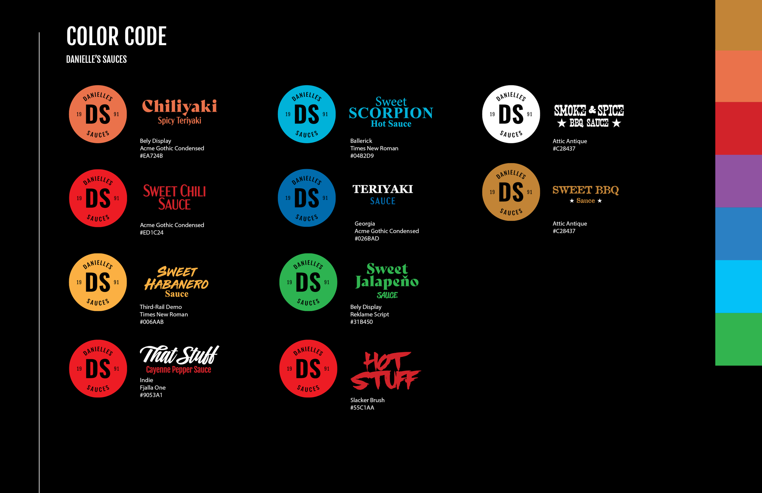
The goal of the rebrand was to modernize the visual identity and improve shelf presence in an increasingly competitive market. I redesigned the logo using a simplified, contemporary approach that retained the brand's recognizable circular shape, allowing for flexibility across packaging, merchandise, digital platforms, and promotional materials. The founding year, 1991, remained a key element of the identity to celebrate the company's legacy and reinforce its long-standing reputation for quality.
The primary color palette was inspired by the ingredients at the heart of the product line—red chilis, cayenne peppers, and paprika—creating an immediate visual connection to the sauces themselves. By simplifying the master brand, I created a flexible system that allowed each flavor to develop its own distinct personality while remaining visually connected to the overall brand.
To differentiate products on crowded retail shelves, each flavor was assigned a unique color palette and typography treatment. Combined with a bold black label system, the packaging created strong contrast, improved product recognition, and established a cohesive yet dynamic family of products. The result was a modern brand identity that elevated Danielle's premium positioning while helping each flavor stand out with confidence and character.